Make a Chart of Average, Maximum and Minimum Values in Microsoft Excel


By Jim Gordon, co-author of
Office 2011 for Mac All-in-One For Dummies
in collaboration with

SUNY at Buffalo Professor Robert Wetherhold, AMSE fellow


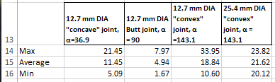
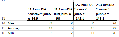
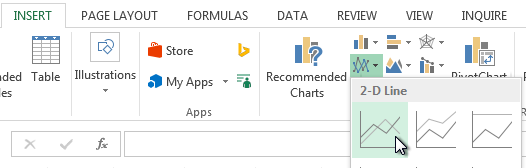
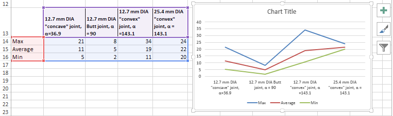
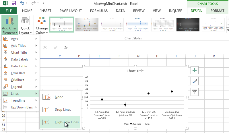
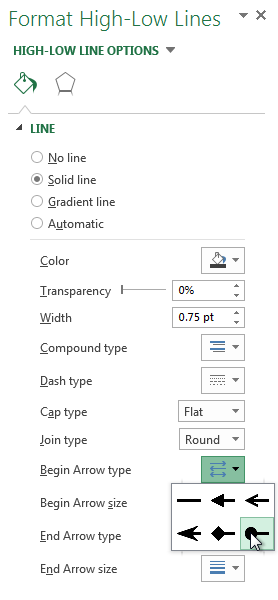
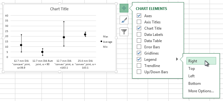
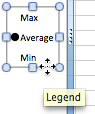
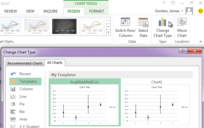
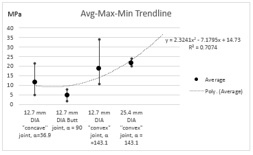
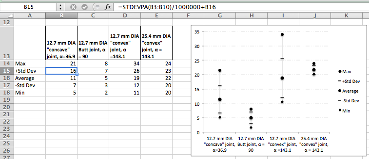
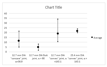
These instructions explain how to make an Average-Max-Min chart like this one:

AvgMaxMin Basic Chart

These instructions are for Microsoft Excel 2013.

Instructions for Excel 2011 can be found here.


An Average-Max-Min chart displays the average, maximum, and minimum values where the average is plotted with greater importance. This chart type is used by engineers and scientists. An avg-max-min chart type can be used when an uneven number of data records exist, when gaps exist in the data, or when  insufficient samples exist for a more complete analysis.

You're going to need some data to work with. Notice
there gaps in the data set.


Using this tutorial you will make an Avg-Max-Min chart. The tutorial also explains how to save your chart as a template.

Follow these steps to make a really great looking Avg-max-min chart.

1. Download the example workbook by clicking the green Excel icon. Your web browser will save AvgMaxMinChart.xlsb in your web browser's default download location. (You can find and set this location in your web browser's preferences.)
2. Open the file AvgMaxMinChart.xlsb in Microsoft Excel.

Notice that our example research data is in the range B2:E10.  We will not attempt to directly graph the research data. Instead we will calculate the maximum, average, and minimum for each column of the data-set and make our chart from the calculations. A range below the dataset has been started for this purpose. The heading information was copied and pasted from the research data-set. When working on your own data, be sure to leave at least two completely blank rows between the end of your data-set and the calculated data's heading information.

In our example, our values must be divided by 1,000,000 to be converted from Pa to MPa, so our formulas include a division by 1,000,000. When you work with your own data you would not include division or correction factors unless you need to change units.

3. Enter the following formulas to calculate the maximum value for each column in the data-set:
In Cell B14 enter =MAX(B3:B10)/1000000
Copy this formula to columns C, D and E in row 14

When choosing the cell range with your own data, use the column that covers the largest complete data range and then copy that formula to the adjacent columns. MAX, MIN and AVERAGE ignore blanks, but zero values are included in these calculations.

4.
Enter the following formulas to calculate the average value for each column in the data-set:
In Cell B15: =AVERAGE(B3:B10)/1000000
Copy this formula to columns C, D and E in row 15

5. Enter the following formulas to calculate the minimum value for each column in the data-set:
In Cell B15: =MIN(B3:B10)/1000000
Copy this formula to columns C, D and E in row 16

Your calculated data should be:

Your calculated
                data

6. Select the cell range B14:E16 to select the calculations
7. On the Home tab of the Ribbon, in the Number group, set the format to Number and then click the Decrease Decimal or Increase Decimal to set the desired number of decimal places to display in the chart.

Set number format to one decimal place

Your calculations will now show be values with whole numbers like this:

Calculated data is ready

You're now ready to make your chart.

8. While the selection cursor is in any cell in our calculation range (as shown above), on the Insert tab of the Ribbon, click Line, and from the palette, in the 2-D Line section click on Line (the first option) to make a line chart.

Choose a Line chart

Your calculated data and chart should look like this:

Initial chart

The chart now needs to be formatted. You format each line
independently. Start by making the Max, Min and Average lines invisible. The trick here is that the lines will still exist in the chart. Even though you can't see the lines, you can connect their data points with new max-min lines.

9. Click on the Max line. This action selects the Max line, which you can tell because the data points become highlighted. At the same time, the Chart Tools Design and Format tabs display in the Ribbon, and the Format Data Series pane displays to the right of your worksheet.

10. In the Format Data Series pane on the right, under Series Options under the bucket choose Line. Choose No Line, as shown here.

Choose No Line and No Markers 

11. While the Max series is still selected, under the bucket choose Marker. Click the disclosure triangle for Marker Options to display marker options. Choose None.

Set Marker to None

13. Click on the Min line. Repeat the formatting actions you performed on the Max line (Choose No Line and set Marker to None).

14. Click on the Average line. In the Format Data Series pane on the right, under Series Options under the bucket choose Line. Choose No Line.

15. With the Average line selected, in the Format Data Series pane on the right, under Series Options under the bucket choose Marker. Under Marker Options choose Built-in, set Type to the smaller circle, set Size to 7, set Fill to Solid Fill and choose black as the color. Set Border to No line as shown:

Set maker style for Average
                                      points


15. While the Average line is still selected, In the Design tab of the Chart Tools section of the Ribbon, click the Add Chart Element button. From the pop-up menu choose Lines > High-Low Lines, as shown:

Add Hi-Low chart lines

16. Next, format the high-low lines. Click a high-low line. The Format High-Low Lines pane displays on the right. Set Begin Arrow Type and End Arrow Type to Oval Arrow. Set Begin Arrow Size and End Arrow Size to the smallest size. The other default settings are fine. See screen shot:


Choose Begin and End style

Your chart looks excellent right now, but there are some finishing touches that can make it look truly professional. Next, format the chart's legend so that the legend displays on the right and only Average displays.

17. To move the legend to the right, click the big plus sign + that displays to the right of your chart. From the CHART ELEMENTS pop-up menu choose Legend > Right as shown.

Move legend to the right side of the chart

23. To remove the Max and Min labels, click once on the Legend to select it. The corners of Legend should be highlighted, as shown:

Select the legend

22. Click into the Legend to select Max. The Legend highlight turns off, and Max becomes highlighted, as shown:

Select Max label in the Legend

23. While Max is selected, on your keyboard, press the Delete key to delete the Max label from the Legend.

24. Once again, Click once on the Legend to select it. The corners of Legend should be highlighted.
25.
Click into the Legend to select Min. The Legend highlight turns off, and Min corners will be highlighted.
26. While Min is selected, on your keyboard, press the Delete key to delete the Min label from the Legend.

Here's what your finished chart should look like:

AvgMaxMin Basic chart

You should save your workbook at this point.

There are several optional steps you may wish to take with your chart: rename the chart title, save your customizations as a Chart Template, add a label to the Y-axis, add a trendline or regression, or add standard deviation markers.

Change the Title of your Chart:

1. Click once on the border of the chart title to select the title text box.
2. While the chart title box is selected, Double-click or right-click inside the chart title text. Select the text and then type to change the text.
3. (Optional) While the chart title box is selected the Format Chart Title pane displays to the right. Use the Format Chart Title pane to change the appearance of the Chart Title.

Save your chart as a Chart Template.

1. Right-click on the border of the chart. From the resulting menu choose Save as Template. The Save Chart Template dialog displays.
2. In Save As, change the file name to AvgMaxMin4Col.crtx
3. Click the Save button.
4. Quit Excel (press Control-Q). Re-open Excel to refresh the Templates list in the Ribbon.

Now you can format a chart in a single click. To try out applying a saved chart template, start over at Step #1 at the very beginning of this web page a download another copy of
AvgMaxMinChart.xlsb. Set up the calculations and add a line chart as described in steps #1 through #7. While the selection cursor is anywhere in the data range, on the Insert tab of the Ribbon, click the All Charts button, then choose the All Charts tab. Choose Templates in the left column of options. Your saved template will be available. Choose AvgMaxMin4col. A chart will appear formatted with the most of the formatting as when you saved your chart template.

Chart template files (.crtx) can be shared with other Excel Mac and PC users. Put chart template files into an appropriate directory:
On your PC you could choose:
C:\Users\UserName\AppData\Roaming\Microsoft\Templates\Charts
On a Mac:
Chart templates go into this (usually hidden Library) UserName/Library/Application Support/Microsoft/Office/Chart Templates/

Use your
                                                        saved template

Add a Y-axis label

Excel doesn't have a built-in way to display a label for the Y-axis in your Avg-Max-Min chart. The work-around is to add a shape text box to the chart.
1. Click in a blank area on your chart
2. Click the Insert tab of the Ribbon and choose Text > Text box.
3. Drag across your chart to make a text box.
4. In the text box, type the label to be used for the Y-axis.
5. While the shape is selected, on the Drawing Tools Format tab of the Ribbon, in the Shape Styles group, click the Shape Fill button. Choose No Fill from the pop-up palette.
6.
While the shape is selected, on the Drawing Tools Format tab of the Ribbon, in the Shape Styles group, click the Shape Outline button. Choose No Outline from the pop-up palette.
7. (Optional) Double-click the text within the text box to format the text itself.
8. Position the shape as desired by dragging the text box.

Add a Trendline or Regression

If you wish to add a Trendline or regression, do the following:
1. Right-click one of the Average data points. From the pop-up menu choose Add Trendline to display the Format Trendline pane.
2. In the Format Trendline pane, in the Trendline Options choose a Trend/Regression type and an appropriate order or period for your data. Our example below is a Polynomial order 2 trendline.
3. (Optional) In the Format Tendline pane you can choose additional options or typing a custom label (Trendline Name) for your trendline, add a forecast period, set the intercept, and display the equation of the line and/or the R2 value to your chart.
4. (Optional) In the Format Trendline pane, click the bucket icon to display options to format the trendline.
To re-display the Format Trendline dialog, double-click the trendline.

This example shows our chart with a polynomial trendline with a forecast period:

AvgMaxMin
                                                          with
                                                          trendline

Add Standard Deviation to your chart

If you wish to add standard deviation values to your chart, do the following:
The secret is to add two rows to your chart's data source (see example below). Add one row for the positive values of the standard deviation, and a second row for the negative values. You'll need to use cell formulas to calculate the standard deviation of your data, and add or subtract that value from the Average. Format the chart similarly, but choose a different marker style for the plus and minus standard deviation values.

AvgMaxMin
                                                          chart with
                                                          standard
                                                          deviation


.


Jim Gordon's MVP Home